
The main project for this week was creating a little book as my contribution to the monthly Instagram book arts challenge. The theme for May is #areyoubookenough_environment.
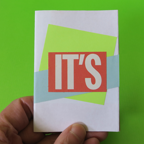
I decided to create a little book that is environmentally-friendly. I made a small one-page book out of repurposed materials. Everything came out of the recycling bin. The base sheet is a leftover poster from my last solo show, the coloured papers are offcuts from other projects, and the text was cut from two newsprint flyers.
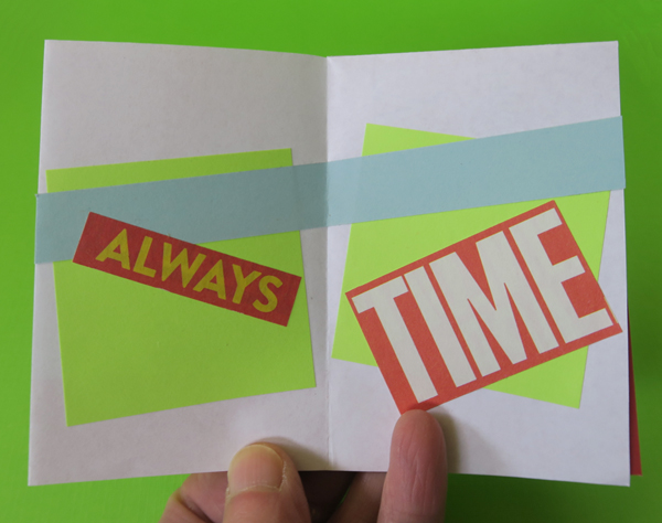

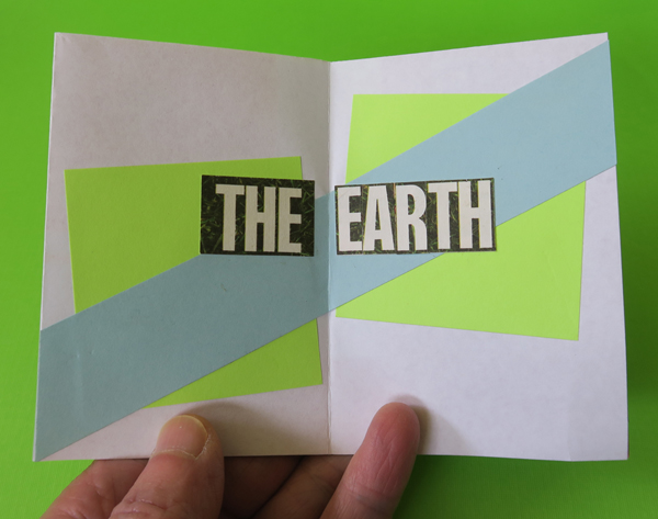
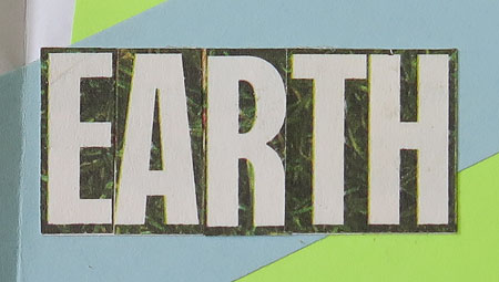
I was able to find whole words for almost everything, but had to construct the word ‘earth’ out of smaller units.
I will be posting the images to Instagram after I finish writing this.
*****
My most recent kite took a bit longer to finish than planned. When I was gluing on the lower sail, one of the joins between the horizontal strut and an angled strut gave way. I cut off the sail, re-attached the strut, and reinforced that connection on both sides. Then I made a new lower sail and finished decorating the kite.
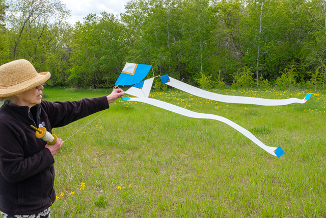
The beginning of the week was windy but also rainy, so it was unsuitable weather for flying paper kites. When the rain stopped, so did the wind. Yesterday, there was enough of a breeze to move the tails for a photograph, but the maiden flight has yet to happen. Perhaps I will get it airborne sometime this coming week.
In other book arts news:
![]()
Andrew Huot of Big River Bindery is offering online classes.
Each online course provides downloadable video demonstrations and PDF instructions so you can watch and make when it is convenient for you. The course website has a place to ask questions and share your successes with the class. Live office hours let you meet the other students and ask questions in person. Optional materials kits are available for each workshop.
You can find the list of in-person and online classes on this page.
*****
![]()
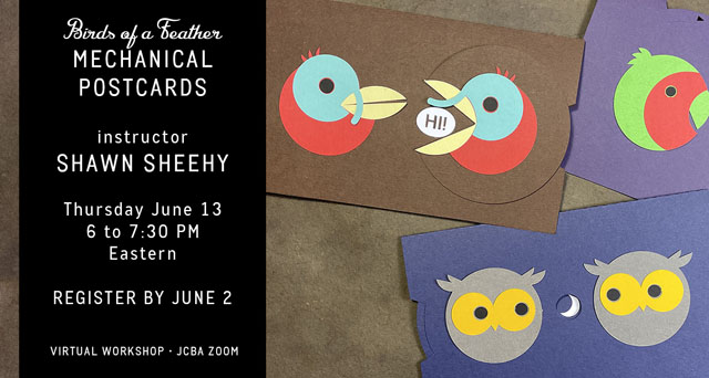
The Jaffe Center for Book Arts is also offering virtual workshops. You can get more information about what is available on their website.
*****
![]()
Kim Tidwell has a short piece on a new typeface Push, designed by Christine Gertsch.
Across its eight weights, seven widths, and 56(!) styles, Push showcases a blend of the Old and New—a type chameleon for the designer’s toolbox. The range of possibilities across the width, weight, and shape spectrum gives designers typographic versatility for today’s multifaceted, complex, and multi-media brand applications.
You can read the full article here.
For even more fun, go to the Push webpage and do some experimenting. A number of the visual elements are interactive, so you can play with the type.
