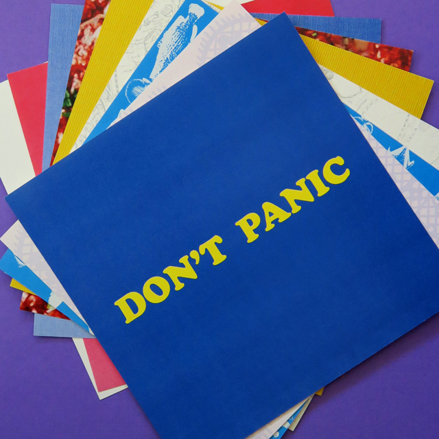
The big project for the past week was the completion of my contribution to the #AreYouBookEnough_Typography Instagram challenge.

The design on the case is a digital conversion of a photo of the label from a French candy box. I corrected the perspective in Photoshop, created an M and a T and inserted them while adjusting the spacing as much as I could. It took the better part of an afternoon. (There are likely quicker ways to achieve this result, but I don’t know them.)

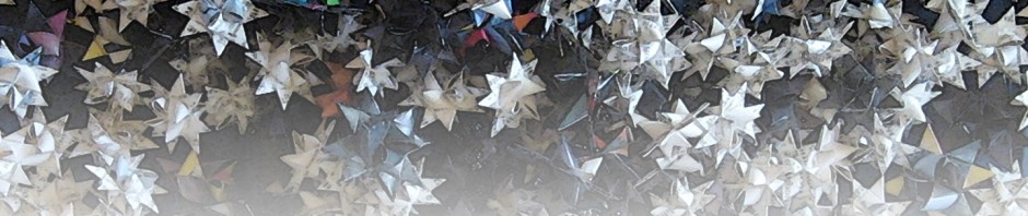
There are nine mini broadsides inside the case. Some of the images are completely digital. The one below is a combination of an antique map —darkness adjusted for emphasis on the compass rose— and digital type.

Some were made manually and then photographed.

The background in this one uses two digital fonts: FishyPrint One and FishyPrint Two.

The next broadside was created using a file from designer dashad

and digitally reworked letters that I adapted from the following screen shot of an Instagram post by Letterform Archive.

Since my original image was low resolution, the final P and Q are a bit pixellated but I decided they would do.

This is a photo with the kind of beads used to make baby name bracelets.

I used punched out letters for this one.

Some of the texts come from old adages, some from quotations, and some (like this one) are quotations that became catch-phrases. I chose Cooper Black for the the “large, friendly letters” as it is the friendliest-looking typeface I know.

I made this image by combining a screen shot and a photograph.

You may recognize the once-famous Instagram egg that I used for the last broadside.


Here’s is the full set of mini broadsides, printed and trimmed.
In other book art news:
![]()

Skin Deep has an article on the new prayer books for the Chapel Royal St James.
*****


If you are interested in old manuscripts or the history of engineering (or both), you can have a look through the Manuscript of Ismail al-Jazarī’s Ingenious Mechanical Devices (ca. 17th century) and read an article about it here.
*****
![]()

Ellen Lupton interviewed Elliot Jay Stocks about his new book, Universal Principles of Typography. You can read her piece on this webpage.

The offering from the Public Domain is inspiring! I am so tempted to make an asemic series of ingenious mechanical devices for GLP comics. Cooper Black was my typeface of choice for making helpful signs when I worked at a bookstore. “Friendly” was exactly the attitude I wanted to communicate.
LikeLike
I would love to see a series of asemic devices.
; ]
Cooper Black is an excellent choice for friendly signage.
LikeLiked by 1 person
As it happens, I will be mentioning Cooper Black in my post today; I hope you don’t mind if I link the name to your post.
LikeLike
Go right ahead.
; ]
LikeLike
Pingback: Spring Cleaning | Vraicking